You open Google Search Console and see a worrying line: clicks and impressions are down.
The natural reaction is to update the post. Perhaps the introduction needs rewriting. Perhaps competitors added more detail. Or perhaps Google no longer likes the page.
Sometimes that is true. But if the article covers hiking in the Dolomites, Christmas markets in Vienna, Greek islands, ski resorts, or another seasonal travel topic, the page may not be the main reason for the decline. Fewer people may simply be searching.
A hiking guide can lose 30% of its impressions as winter approaches and still perform well relative to the available demand. Another guide may lose only 10% while interest in the destination grows by 20%. The second page looks healthier in a basic traffic report, but it is the one I would examine first.
To tell the difference, compare two movements over the same period:
- How did your page’s Google Search impressions change?
- How did search interest in the destination or topic change?
Then look at clicks and click-through rate separately. That extra step helps you distinguish lower demand from a visibility loss, and from a page that still appears in search but earns fewer visits.
Table of Contents
Why travel-content performance is easy to misread
Travel demand rarely moves in a straight line. Seasons, school holidays, weather, flight routes, major events, prices, wildfires, trail closures, and viral social posts can all change what people search for.
The planning journey also takes time. A traveler may discover a destination months before booking, return to an itinerary several times, check a map, compare hotels, and finally reserve through another device or website. A single session tells only part of that story.
Search results add another complication. Maps, hotel and flight modules, forums, videos, AI Overviews, and AI Mode can all change the number of clicks available even when your page remains visible.
This is why a traffic decline is a starting point, not a diagnosis. Google itself recommends using Search Console together with Google Trends when investigating a search-traffic drop.
Start with the job of the page
Before comparing numbers, decide what the page is supposed to do.
An inspiration post, such as “12 beautiful places to visit in Slovenia,” may introduce readers to a destination. Impressions, new visitors, image visibility, saves, and later branded searches may matter more than immediate affiliate clicks.
A planning post — an itinerary, transport guide, budget breakdown, or neighborhood comparison — should help a traveler move forward. Useful signals may include search clicks, return visits, map interactions, and internal clicks to more detailed guides.
A decision post about hotels, tours, travel insurance, eSIMs, or hiking gear is closer to a purchase. Qualified outbound and affiliate actions carry more weight there.
You don’t need a different dashboard for every article. You do need to avoid judging an inspiration guide by the same standard as a hotel comparison. I explain these roles in more detail in my guide to travel keywords, visibility, and clicks.
For the method below, the main signal is impressions. They show how often your page appears in Google Search and are less affected than clicks by a changing result page. Clicks, CTR, and useful actions then help explain what happened after the impression.
Step 1: compare the right periods in Google Search Console
Start with the page you’re investigating, or with a small group of pages about the same destination. A cluster can be more reliable when each article has limited data.
In the Performance report:
- Filter by the page or a closely related page group.
- Select the longest available date range, normally up to 16 months.
- When possible, compare the current period with the same dates one year earlier. You don’t need two complete years of data: for example, June 1–July 15, 2026 can be compared with June 1–July 15, 2025.
- If the page was published during the earlier period, compare only the dates for which it was live and reasonably established. A guide published on July 10, 2025 shouldn’t be evaluated as though it had been available throughout June and July.
- Keep the country, device, and search type consistent.
- Record impressions, clicks, CTR, and average position.
A newly published guide may not yet have a clean year-over-year baseline. In that case, compare equivalent weeks after publication or use the previous comparable period, but label the result as provisional. Google Trends can show whether the destination followed its usual seasonal pattern, while the page’s first complete season becomes your baseline for future reviews. Avoid calculating DAVI (more on that in step 3) from a very short launch period, because indexing, initial ranking changes, and limited data can distort the result.
For strongly seasonal travel content, a year-over-year comparison is usually more useful than comparing the last three months with the previous three. An article about Dolomites hikes shouldn’t be expected to receive the same demand in November as it did in August.
When a clean year-over-year comparison is available, use matching dates with the same number of completed days. If the guide was published during the earlier period, compare only the dates for which it was live and treat the result as provisional. Its first complete season will provide a more reliable baseline for future reviews.
If the post receives meaningful visibility from Google Images or video results, review those search types separately. A decline in web results can otherwise hide an image-search gain, or the reverse. For an image-led post, my alt-text guide for travel photos explains how to give those visuals clearer context.
Suppose a page shows the following year-over-year numbers:
| Previous comparable season | Current comparable season |
|---|---|
| 10,000 impressions 600 clicks 6% CTR average position 8.4 | 8,000 impressions 360 clicks 4.5% CTR average position 8.1 |
Impressions fell by 20%. Clicks fell by 40%. Average position remained broadly stable, while CTR declined.
That is useful, but it’s not enough to decide what to change. We still don’t know whether the 20% impression drop is specific to this page or part of a wider fall in destination demand.
Treat average position carefully, too. It’s an aggregate across queries, locations, devices, and result types. A stable average can hide gains for some searches and losses for others. Open the Queries tab and check whether the page stopped appearing for an important group of questions.
Step 2: check whether destination demand changed
Open Google Trends and search for the destination or travel topic behind the page.
When Google offers a suitable Topic, I usually start there. A topic can include related searches across languages and variations, which is useful for a place with several names or spellings. Check that the topic really represents the destination you mean. A place name shared by a city, hotel, film, or sports team can produce a misleading graph.
If no suitable topic exists, use the query that best matches the page. For a broader guide, compare a small group of representative searches rather than relying on one unusually specific keyword. Your keyword cluster should reflect the same planning need, not every query that happens to mention the destination.
Match the settings to your Search Console comparison:
- Use the same country or audience geography.
- Select a date range that includes both comparison periods.
- Choose a specific destination Topic when one is available. If you use a search term instead, make sure it is specific enough to exclude unrelated meanings.
- Keep Web Search selected for a standard GSC web comparison.
- Test Image Search or YouTube Search separately when those formats matter.
Keep both comparison periods inside one Trends date range. If you open each period in a separate chart, Google rescales each one from 0 to 100, so the values are no longer directly comparable. For a year-over-year review, choose a range that includes both years and compare matching dates within the same graph.
What the Google Trends numbers mean
Google Trends doesn’t show monthly search volume. It uses a sample of searches, normalizes the data for the selected time and place, and scales relative interest from 0 to 100. A value of 100 marks the peak within that comparison; it doesn’t mean 100 searches.
This matters because you should compare the direction and relative change, not treat the graph as a traffic total. Google also notes in its Trends data FAQ that low-volume terms may appear as zero and that the data isn’t a perfect mirror of all search activity.
There is one more limitation worth knowing in the AI-search era: Google says Trends excludes internal searches made within AI Mode and AI Overviews. Use it as a demand proxy for Google searches, not as a complete measure of every way travelers research a destination.
Step 3: calculate a demand-adjusted visibility index
You can stop at a directional comparison. If destination interest and impressions both fell by about the same amount, demand probably explains much of the decline. If impressions fell much faster, your page likely lost relative visibility.
For a more consistent review, I use a simple calculation. I call it the demand-adjusted visibility index, or DAVI. This is a RankTrails diagnostic, not an official Google metric.
A note about the name: demand-adjusted visibility index (DAVI) is not a standardized SEO metric. You may find the same or similar term used online for other calculations, including metrics that weight keyword visibility by search volume. In this guide, DAVI refers specifically to the RankTrails comparison between changes in Google Search impressions and changes in Google Trends interest.
Download the “Interest over time” CSV from Trends and calculate the average for each period you’re comparing. Averaging the weekly or monthly points is usually more useful than choosing one peak or one quiet week.
First, turn both current values into indexes where the previous comparable period equals 100: current index = (current value ÷ previous comparable value) × 100
Then compare the two indexes: demand-adjusted visibility index = (GSC impression index ÷ Google Trends interest index) × 100
Return to the example above:
- GSC impressions fell from 10,000 to 8,000. The impression index is 80%.
- Average Google Trends interest for the same periods fell from 50 to 35. The demand index is 70%.
- DAVI = 80% ÷ 70% × 100 = 114.
Raw impressions are down 20%, but the Trends proxy is down 30%. Relative to that change in demand, the page’s visibility is about 14% stronger than in the previous comparable period.
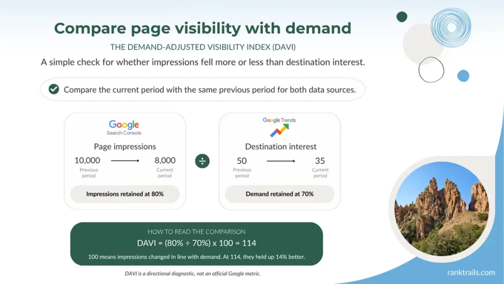
Free download: get a high-resolution PNG of the DAVI framework to use as a reference when analyzing your own Search Console and Google Trends data.
That does not mean the page owns 14% more market share. Search Console and Google Trends measure different things, and Trends data is sampled and normalized. The index is a practical warning light. It helps you decide where to look next.
As a working interpretation:
- Around 100: impressions moved roughly with demand.
- Above 100: the page held up better than demand.
- Below 100: the page’s impressions weakened relative to demand.
Don’t set rigid pass and fail thresholds. Low-volume data, query-mix changes, and an imperfect Trends match can move the result. I’d pay more attention to a repeated pattern across two or three comparable periods than to a small difference in one month.
The no-formula version
If you don’t want another spreadsheet metric, ask four questions:
- Did impressions fall at roughly the same rate as demand?
- Did impressions fall faster than demand?
- Did demand rise while impressions stayed flat?
- Did impressions rise while clicks fell?
Those four patterns lead to different actions.
Step 4: use the pattern to choose an action
The aim isn’t to give every falling page an update. It’s to choose the response that fits the evidence.
| What you see | Likely explanation | What to do next |
|---|---|---|
| Demand and impressions both fall by a similar amount; position is stable | Mostly seasonal or market decline | Keep the page accurate. Plan the next review before demand usually rises. |
| Demand falls, but impressions fall much faster; position or query coverage also weakens | Relative visibility loss | Check freshness, search intent, competing pages, internal links, and missing coverage. |
| Demand rises while impressions stay flat or fall | Missed opportunity | Review indexing and content fit. Update or expand the page before the peak passes. |
| Demand is steady; impressions and clicks rise | A real visibility gain | Protect the page and build useful supporting content around it. |
| Demand is steady or rising; impressions rise but clicks fall | Lower click opportunity, weaker snippet, or more low-position queries | Inspect the queries and live result pages. Improve the title, snippet, and practical reason to visit. |
| Trends and GSC data are too thin | Not enough evidence | Use a longer period or a broader, closely related cluster. Avoid a major rewrite based on noise. |
If the evidence points to a visibility loss, don’t begin by adding random paragraphs. Check which searches changed. A page can lose impressions because the destination became less popular, because Google now connects it with fewer queries, or because the search intent shifted.
For example, a guide that once ranked for “where to stay in Madeira without a car” may gradually become a general list of hotels. The page still mentions Madeira and accommodation, but it no longer answers the transport problem clearly. Comparing the lost queries with the page’s current structure will reveal more than chasing a broad word count.
My travel search-intent guide can help when the query pattern suggests that travelers now want a different type of answer.
If impressions remain healthy while CTR falls, inspect the actual result page. A better title and meta description may help, but only when the page offers a reason to click. A current route map, honest costs, booking details, a downloadable itinerary, or firsthand mistakes can give travelers value that a short result-page answer cannot provide. This is also the approach I recommend for travel content affected by AI Overviews.
Step 5: check whether AI and search features changed the click opportunity
Impressions can hold steady while clicks decline because the result page changed around your listing. This isn’t unique to AI. Maps, videos, forums, hotel modules, and other search features have affected travel clicks for years.
Google now gives site owners one more place to investigate. On June 3, 2026, it announced dedicated generative-AI performance reports in Search Console. The Search report covers visibility in AI Overviews and AI Mode. At launch, it reports impressions by page, country, device, and date, and Google is rolling it out to a subset of websites.
The generative-AI impressions are already included in the standard Web performance totals, so don’t add the two numbers together. The dedicated view helps you see where AI visibility occurred; it doesn’t yet give you click or CTR attribution for those appearances. Discover has a separate generative-AI report.
If the report is available in your property:
- Check whether the page received generative-AI impressions during the comparison period.
- Compare that movement with standard web clicks and CTR.
- Inspect the same small set of important travel questions in Google and a few AI-search tools.
- Record identifiable AI referrals in GA4 where referral data is available.
Manual checks are samples, not rankings. ChatGPT, Perplexity, Gemini, and other tools can return different sources for different wording, locations, and dates. Record the prompt, platform, date, and cited page instead of treating one answer as proof of broad visibility. My Perplexity research guide for travel bloggers shows a practical way to do that without turning the exercise into citation chasing.
Step 6: check whether the page still helps travelers act
A page can lose search clicks and still help the travelers who reach it. It can also gain traffic without helping anyone take the next step.
Choose actions that match the page’s role. For a planning guide, useful actions might include:
- Opening a detailed itinerary or destination hub
- Clicking a map, train operator, attraction, hotel, or tour link
- Saving, printing, copying, or downloading an itinerary
- Joining an email list for a useful planning resource
- Returning to the page later in the planning period
For a decision page, a qualified affiliate click may matter more. And for an inspiration post, a saved article or an internal click to a practical guide may be the better sign.
GA4 can record some of these interactions, but its default measurements are limited. The standard enhanced-measurement scroll event fires the first time 90% of a page becomes visible. It doesn’t tell you whether someone used your itinerary table, copied an address, opened the map, or compared two hotel areas. Google’s enhanced-measurement documentation also explains the automatic outbound-click event.
For important tools and planning elements, create specific events with clear names. A map_open or itinerary_download event is easier to interpret than a generic click count.
Don’t use engagement to excuse a genuine visibility problem. Use it to decide what is worth protecting. If a seasonal guide drives few visits in winter but sends a high share of readers to a related booking page, keep that contribution in mind before consolidating or deleting it.
What this method cannot tell you
Demand-adjusted analysis gives you a better diagnosis, not a complete explanation.
- Google Trends is a relative demand proxy, not exact search volume.
- GSC average position is aggregated and can hide a changing query mix.
- Search Console tables omit some low-volume data.
- Google’s dedicated AI reports currently show impressions without click attribution.
- External AI tools don’t reveal every time they considered or displayed a source.
- An outbound click doesn’t prove that a traveler booked.
- A gain after an update doesn’t prove that the update caused it.
Use the method to narrow the investigation. If the entire site drops suddenly, check indexing, manual actions, security issues, migrations, tracking changes, and confirmed Google updates before blaming destination demand.
A simple monthly or seasonal review template
You can track the method in a spreadsheet without building a complicated dashboard.
| Page or cluster | Page job | Comparison period | GSC impression change | Trends demand change | DAVI | Click/CTR pattern | AI visibility note | Decision | Next review |
|---|---|---|---|---|---|---|---|---|---|
| Dolomites hiking guide | Planning | Sep–Oct YoY | -20% | -30% | 114 | Clicks fell faster; CTR down | AI impressions present | Review snippet; keep content accurate | May |
Use plain decisions that are easy to revisit:
- Leave accurate and monitor.
- Refresh before the seasonal rise.
- Improve the snippet and click value.
- Add missing intent.
- Strengthen internal connections.
- Consolidate only after reviewing the page’s contribution.
For strongly seasonal pages, the “next review” date matters. Updating a Christmas-market guide in late December is less useful than checking it before interest begins to rise in autumn.
FAQs about travel demand and falling search traffic
Not automatically. Compare impressions with destination demand. If both fall at a similar rate and the page maintains its query coverage, seasonality is a reasonable explanation. If impressions fall much faster, investigate the page.
No. Trends shows normalized relative interest on a 0–100 scale. Use it to compare movement across similar periods, not to estimate an exact number of searches.
Try a broader destination topic or a small cluster of related queries. You can also compare several related pages in Search Console. If the data remains thin, rely on longer periods and manual SERP checks rather than calculating DAVI.
Update it before the next rise if information has changed or the page has lost relative visibility. If it remains accurate and impressions simply followed demand down, schedule the review for the weeks before searches usually increase.
CTR may have fallen because the result page changed, the title or snippet became less appealing, competitors offered a stronger reason to click, or your page appeared for more low-position queries. Average position can hide all of those differences, so review queries and live search results.
Google began rolling out dedicated generative-AI performance reports in June 2026. The Search report shows impressions for AI Overviews and AI Mode by dimensions such as page, country, device, and date. It isn’t yet available to every property.
Not through the dedicated report at the time of writing. It provides an impression view, while the standard Web report continues to include the overall data. Avoid claiming that an AI appearance caused a particular click or decline.
Monthly is enough for important pages with steady data. For smaller blogs and seasonal topics, review around the same points in the demand cycle: before the rise, near the peak, and after the season. Consistent periods are more useful than constant checking.
Final thoughts: measure the page against the demand available
A traffic decline tells you what happened to your visits. It doesn’t tell you why.
Compare Search Console impressions with destination demand before rewriting a seasonal post. Then use clicks, CTR, AI visibility, and useful traveler actions to understand the rest of the story.
If impressions fell because fewer people searched, keep the page accurate and prepare it for the next rise. If the page lost visibility faster than demand, investigate while there is still time to recover. And if demand grew and your impressions did not, you have found an opportunity that a basic traffic report would have missed.
The fairest question isn’t “Did this page get less traffic?” It is “How well did this page perform for the demand that was available?”